Shop the Look
A shoppable outfit carousel: scroll to bring the next look to center, tap pins on the garments, and add single pieces or the full bundle from a synced sidebar.
Try the Look.
Six looks, styled head to toe. Scroll or tap a pin to see the piece.
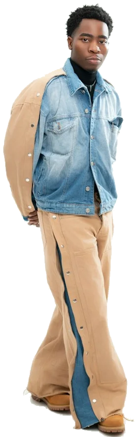

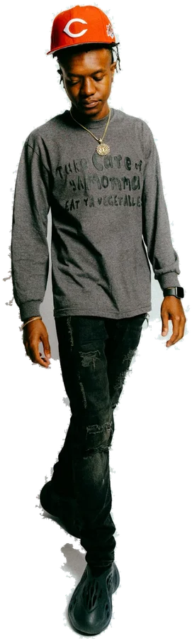

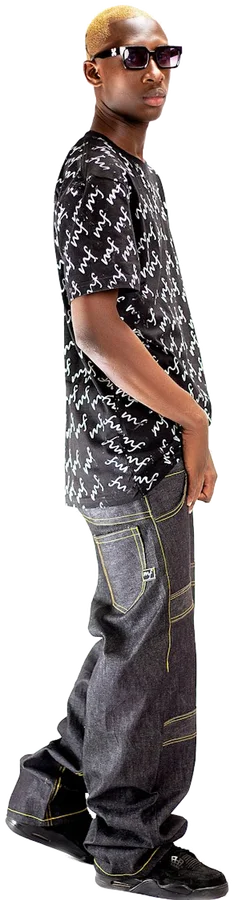
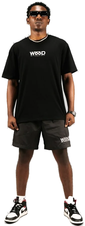
Customize
Scroll over the stage, drag, use the arrows or your keyboard. Pins and the sidebar stay in sync. Demo bag: 0 items.
Overview
About the Shop the Look
A shoppable outfit carousel: scroll to bring the next look to center, tap pins on the garments, and add single pieces or the full bundle from a synced sidebar. It is delivered as editable TypeScript for React. Self-contained, instance-scoped CSS. Tailwind CSS is not required. No animation package required. Its focused API can be adapted to your own content and visual system.
Usage
When to use it
- Fashion storefronts presenting complete outfits with a bundle discount.
- Seasonal lookbooks and campaign pages that link each garment to its product.
What’s included
Files in the product ZIP
Shop the Look source
components/shop-the-look.tsxEditable React and TypeScript component source.
Working example
examples/example.tsxA minimal import and render example that matches the packaged API.
Installation guide
README.mdManual ZIP installation, styling, compatibility, asset, and usage notes.
Usage
Import and render
Copy the packaged source to the documented path, then use the public API shown below.
import { ShopTheLook, type Look } from "@/components/shop-the-look";const looks: readonly Look[] = [
{
id: "studio-day", title: "Studio Day", image: "/looks/studio-day.png", imageAlt: "Model in a grey sweater and wide jeans",
pieces: [
{ id: "crew", brand: "Your Brand", name: "Ash Crew Knit", price: 128, image: "/products/crew.jpg", pin: { x: 52, y: 34 } },
{ id: "denim", brand: "Your Brand", name: "Loose Denim", price: 112, image: "/products/denim.jpg", pin: { x: 40, y: 64 } },
],
},
];
export default function Lookbook() {
return <ShopTheLook looks={looks} bundleDiscount={10} onAddLook={(look, { bundleTotal }) => console.log(look.id, bundleTotal)} />;
}Props
Component API
| Prop | Type | Default | Description |
|---|---|---|---|
| looks | readonly Look[] | — | Looks with id, title, image, imageAlt and pieces. Each piece has id, name, price, image, optional brand, imageAlt, badge and pin {x,y} in percentages of the look image. |
| title | string | "Try the Look." | Stage heading. |
| subtitle | string | "Six looks, styled head to toe. Tap a pin to see the piece." | Small line under the heading; empty hides it. |
| height | number | 560 | Stage height in CSS pixels, 380–900. Capped at 520 below 760px container width. |
| currency / locale | string | "USD" / "en-US" | Intl.NumberFormat currency and locale for prices. |
| bundleDiscount | number | 10 | Percent saved when the full look is added, 0–90. Zero hides the strike-through price. |
| blur | number | 6 | Maximum blur in CSS pixels for figures beside the active look. |
| visibleSides | number | 2 | Looks visible on each side of the center, 1–4. |
| loop | boolean | true | Wrap from the last look to the first. |
| autoPlay | boolean | false | Advance automatically; pauses on hover, focus, offscreen and hidden tabs. A pause button is always shown. |
| autoPlayInterval | number | 4500 | Milliseconds each look stays, 1200–20000. |
| wheelNavigation | boolean | true | Mouse wheel and trackpad scrolling over the stage change the look. Page scrolling continues at the ends when loop is false. |
| showSidebar | boolean | true | Show the In this look sidebar with pieces and the bundle button. |
| accentColor / backgroundColor | string | "#141414" / "#f3f2ef" | Pins, progress and buttons / component background. |
| defaultIndex | number | 0 | Initial zero-based look. |
| onLookChange | (index: number, look: Look) => void | — | Called after navigation changes the active look. |
| onAddPiece | (piece: LookPiece, look: Look) => void | — | Called by the + button on a piece. Connect it to your cart. |
| onAddLook | (look: Look, totals: { total: number; bundleTotal: number }) => void | — | Called by Add full look to bag with the original and discounted totals. |
| className / style | string / CSSProperties | — | Root class and inline styles. |
Navigate by scrolling over the stage, dragging horizontally, the arrow keys while the stage is focused, the arrow buttons, the progress steps, or by clicking a side figure. Pins appear only on the centered look; tapping one highlights its piece in the sidebar, and hovering a piece highlights its pin. Below 760px container width the sidebar moves under the stage. Reduced motion removes slide transitions. Cart state, checkout and inventory belong to your app; the component only reports add events.
Compatibility
Verified project setup
- ReactLoom's preview is tested with Next.js 16.3.8 App Router, React 19.2.8, TypeScript 5.9.3, and Tailwind CSS 4.3.3. This describes the store environment, not the product's minimum requirements.
- This interactive component includes the "use client" directive and must remain behind a Client Component boundary in the Next.js App Router.
- Self-contained, instance-scoped CSS. Tailwind CSS is not required. No animation package required.
- Images
- Provide your own licensed look images (full-body cut-outs on a transparent or matching background work best) and product thumbnails. The store demo uses Unsplash photos (background removed) that are not distributed in the ZIP.
- Fonts
- No font files are included. The component uses system font fallbacks unless your app supplies a matching font.
Installation
Add it to your project
Download the Shop the Look ZIP, place the source file at src/components/shop-the-look.tsx, and copy the example into your own page or feature folder.
Target path
src/components/shop-the-look.tsxNo additional npm runtime packages are required beyond the React host; follow the styling requirements below.
Styling requirements
- Supply your own licensed look images and product thumbnails. The store demo photos are not included in this ZIP.
- Pin coordinates are percentages of each look image. Full-body cut-outs with consistent framing keep pins and the floor shadow aligned.
- Scrolling over the stage changes the look when wheelNavigation is true. Set it to false if the carousel sits inside a long scrolling page and you prefer arrows, drag and keyboard only.
- Cart, checkout and inventory are not included. Connect onAddPiece and onAddLook to your store; use a Client Component wrapper when passing callbacks in Next.js App Router.
- No third-party code, media, or fonts are redistributed. React and React DOM are host dependencies under their respective MIT licenses.